HER She Loves San Lorenzo Winter edition 2018: Beloved Projects and Lovers

Here you can find the list of the artworks that have been part of the exhibit of the HER She Loves San Lorenzo 2018 Winter Edition festival (the Beloved projects), together with the spaces in the neighbourhood which have hosted them (the Lovers)
Info
Demand Full Laziness
What: Art print / video from a conceptual performance
Who: Guido Segni
Where: sede 4Changing / HER, via dei Rutoli 2
From: Pisa (It)
Details
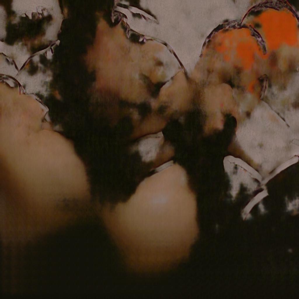
Demand full laziness is a five-year plan and a durational performance about art, labour, self sustenance and laziness. For the next five years (2018 – 2023) artist Guido Segni is going to delegate and automate part of the making of his artistic production by the use of a bunch of deep-learning algorithms in order to increase production, to overcome labour in art and to increasingly get abandoned to laziness.
It is not just about new ways to produce images neither it is yet another bunch of machine-learning algorithms applied to painting, photography or video. Laziness becomes the durational context where to rethink and explore new relationships between imagination and leisure time, artistic gesture and automation, human imagination and algorithmic muse.
The results of the automated process – images, books, objects, whatever – will be sold and distributed to all the supporters of the project at very affordable prices.
It
Demand Full Laziness è un progetto che ha la durata di cinque anni, una performance durazionale che tratta di arte, lavoro, auto-sostentamento e pigrizia. L’artista Guido Segni, per i prossimi cinque anni (2018-2023), ha deciso di automatizzare e delegare a una serie di algoritmi di deep learning parte della sua produzione artistica con l’obiettivo di incrementare la produzione, per superare il lavoro (in ambito artistico) e per abbandonarsi progressivamente alla pigrizia.
Non si tratta solo di nuove modalità di produzione delle immagini e nemmeno dei soliti algoritmi di machine learning applicati alla pittura, alla fotografia o ai video. La pigrizia diventa il contesto durazionale dove si riconsidera e si esplora una nuova relazione tra immaginazione e tempo libero, tra atto artistico e automazione, tra immaginazione umana e ispirazione algoritmica.
I risultati del processo automatizzato – le immagini, i libri, gli oggetti, etc – saranno venduti e distribuiti a prezzi accessibili a tutti coloro che vorranno sostenere il progetto.

Info
My Wastebook Friends
What: decollage di profili pubblici su Facebook
Who: Agnese Trocchi
Where: Atelier Aspecifico MyriamB, Via degli Ausoni, 7
From: Roma (It)
Details
My Wastebook Friends nasce dall’osservazione della perdita dei nostri Sé nella “discarica” della rete. Agnese Trocchi sceglie dei profili pubblici di Facebook Friend, strappandoli e ricomponendoli in suggestivi collage, che si trasforma in un how to ironico, catartico e alla portata di rielaborare le nostre relazioni interpersonali
RICETTA
Ingredienti:
• Account social
• Carta
• Cartoncino
• Forbici
• Stampante
• Scotch trasparente
Istruzioni dell’artista:
Durante le vostre navigazioni sui social network scaricate le foto pubbliche del profilo di gente a vostro piacimento (n.b. possono essere anche vostri amici). – Quando sentite un rush cutaneo invece di mettervi a commentare, scaricate la foto del profilo della persona che vi ha indotto il rush, oppure se avete qualcuno da cui siete ossessionato e che stalkerate, fate la stessa cosa. – Una volta che avrete raccolto un certo numero di foto del profilo attaccate la stampante e stampatele preferibilmente a colori. – Prendete lo scotch e stendetene una striscia sulla foto, strappate – Posate la striscia di schotch su un foglio pulito – Continuate con altre striscie a piacimento, strappando e ricomponendo su un altro foglio.
La tecnica utilizzata per realizzare My Wastebook Friends si chiama decollage, nasce originariamente con il lettrista Gil J Wolman.
Eng
My Wastebook Friends was born from the observation of the loss of our selves in the “dump” of the network. Agnese Trocchi chooses public profiles of Facebook Friend, tearing them apart and reassembling them in evocative collages, which are transformed into an ironic, cathartic how to rework our interpersonal relationships.
RECIPE:
Ingredients:
– Social account
– Paper
– Cardboard
– Scissors
– Printer
– Transparent Scotch
Artist’s instructions:
While browsing social networks, download the public photos of the profile of people as you like (n.b. may also be your friends). When you feel a skin rush instead of commenting, download the profile photo of the person who led you to the rush, or if you have someone you are obsessed with and stalker, do the same. Once you have collected a number of profile photos, attach them to the printer and print them preferably in color. Take the tape and lay a strip on the photo, tear it up – Place the strip of schotch on a clean sheet. Continue with other strips at will, tearing and recomposing on another sheet.
The technique used to make My Wastebook Friends is called decollage, it was originally created with the reader Gil J Wolman.
Info
To Fake or not To Fake
What: printed Infoaestetics
Who: Salvatore Iaconesi + HER – Human Ecosystems Relazioni
Where: sede 4Changing / HER, via dei Rutoli 2
From: Rome (It)
Details
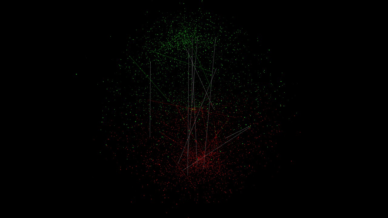
To Fake or not to Fake è la prima rielaborazione artistica dei dati dell’Osservatorio sulle elezioni europee 2019, promosso dal progetto SMART – Study on The Mechanisms that shape Social Media and their impact on Society, tender di ricerca di ricerca finanziato dalla Commissione Europea con l’obiettivo di fornire all’Europa dati, informazioni, conoscenza e idee per orientare le prossime politiche sul tema della disinformazione.
La prima tavola mostra il fronteggiarsi di due opinioni, evidenziate in verde e rosso.
La seconda tavola mostra il diffondersi di una fake news sull’Europa.
Eng
To Fake or not to Fake is the first artistic reworking of data, collected by the Observatory, on the European elections 2019, promoted by the project SMART – Study on The Mechanisms that shape Social Media and their impact on Society, a research tender funded by the European Commission with the aim of providing Europe with data, information, knowledge and ideas to guide future policies on the issue of misinformation.
The first print shows the confrontation of two opinions, highlighted in green and red.
The second print shows the spread of a fake news around Europe.
Info
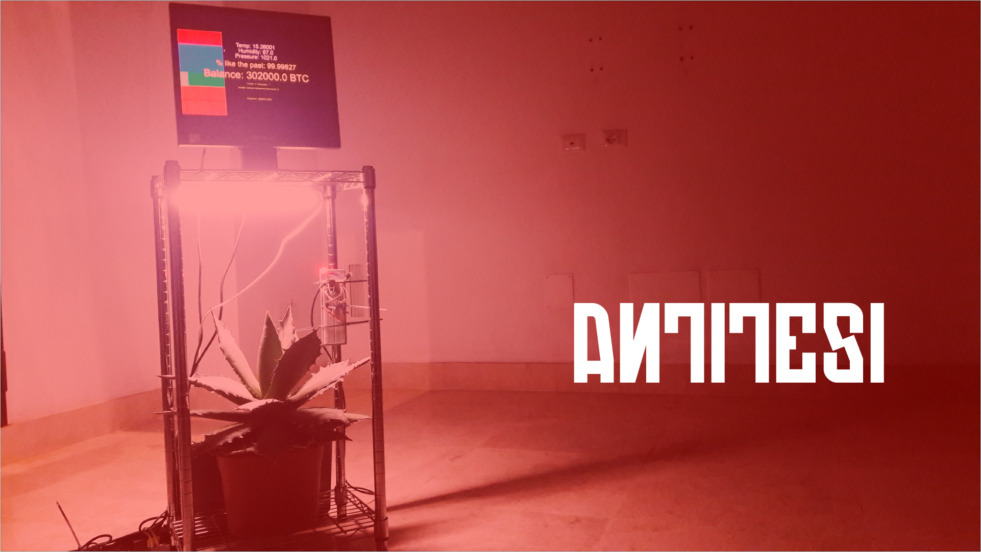
Antitesi
What: installazione: diade composta da Agave + Intelligenza Artificiale
Who: Salvatore Iaconesi + HER – Human Ecosystems Relazioni + INSOR – Istituto Nazionale di Sociologia Rurale
Where: sede 4Changing/HER, via dei Rutoli 2
From: Rome (It)
Details
Una piantina diventa soggetto attivo della lotta al Cambiamento Climatico unendosi all’Intelligenza Artificiale.
Quando Antitesi, attraverso i sensori ambientali, nuove protesi tecnologiche che ne aumentano il corpo, identifica nei dati segnali del Climate Change, si spaventa e usa i Bitcoin ricevuti in dono dalla comunità internazionale per investire a favore delle aziende più virtuose in tema di difesa dell’ambiente, di innovazione energetica, ambientale ed ecologica.
Eng
A plant becomes an active subject in the fight against Climate Change by joining the Artificial Intelligence.
Antitesi, through environmental detectors, new technological prosthesis that increase the body, identifies in the data signals of Climate Change, it gets frightened and uses the Bitcoin that has received as a gift from the international community to invest in favor of the most virtuous companies in terms of environmental protection, and ecological energy innovation.
Info
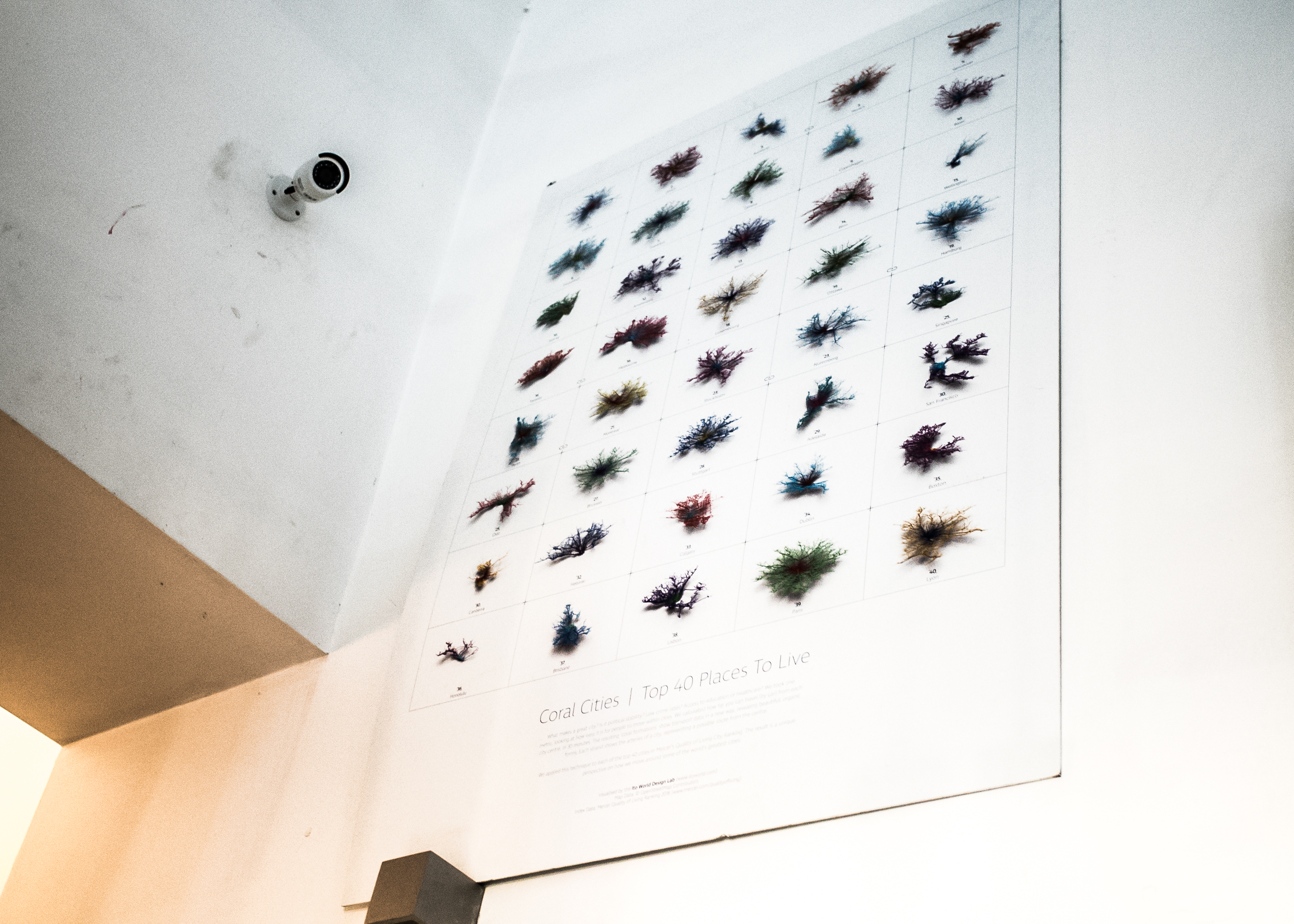
Coral Cities
What: infoaesthetics
Who: Ito World
Where: Bee Bar,Via Tiburtina, 22/26.
From: Manchester, England
Details
What makes a great city? Is it political stability? Low crime rates? Access to education or healthcare? Ito World took one metric, looking at how easy it is for people to move within cities. They calculated how far you can travel (by car) from each city centre, in 30 minutes. The resulting ‘coral formations’ show transport data in a new way, revealing beautiful, organic forms. Each strand shows the arteries of a city, representing a possible route from the centre.
Authors applied this technique to each of the top 40 cities in Mercer’s Quality of Living City Ranking. The result is a unique perspective on how we move around some of the world’s greatest cities.
It
Cosa rende grandiosa una città? La stabilità politica? Il basso tasso di criminalità? L’accesso all’istruzione o all’assistenza sanitaria? Ito World ha scelto una metrica, osservando quanto sia facile per le persone spostarsi all’interno delle città, calcolando la distanza percorribile (in auto) da ogni centro città, in 30 minuti. Le ‘formazioni coralline’ che ne risultano mostrano i dati sui mezzi di trasporti in un modo nuovo, rivelando forme belle e organiche. Ogni sezione mostra le arterie di una città, rappresentando un possibile percorso dal centro.
Successivamente, hanno applicato questa tecnica a ciascuna delle prime 40 città secondo il Quality of Living City Ranking di Mercer. Il risultato è una prospettiva unica su come ci si muove in alcune delle più grandi città del mondo.
Info
Jouska
What: speculative design video
Who: Mathilde Buenerd
Where: Gente di S.Lorenzo,Via degli Aurunci, 42-48| From 12-21 dec sede 4Changing / HER, via dei Rutoli 2
From: Lyon (Fr) / Geneve (Sw)
Details
Jouska is a speculative design project exploring the future of sentiment analysis. It takes the form of a video imagining the future implication of the daily use of such algorithms. The video takes place in a near future, in which the daily use of sentiment analysis on personal communications would allow its users to have a better understanding of the way they talk, and in the end, of one of the others. This way, they would develop a form of immunity at targeted solicitations from advertisers, politicians, or noxious relations. Above all, the video highlights the tension between being manipulable and manipulative with sentiment analysis.
It
Jouska è un progetto di design speculativo che esplora il futuro della sentiment analysis. Prende la forma di un video che immagina le implicazioni dell’uso degli algoritmi nella vita di ogni giorno. Il video è ambientato in un futuro prossimo, la sentiment analysis applicata alla vita quotidiana e alle comunicazioni personali consente agli utenti una maggiore comprensione del modo in cui parlano e, in fin dei conti, gli uni degli altri. Il questo modo gli utenti sviluppano una forma di immunità ad alcune sollecitazioni targettizzate, di tipo pubblicitario o politico, o relazioni dannose.
Il video evidenzia, in particolare, la tensione tra l’essere manipolabili e manipolativi con l’analisi dei sentimenti.
Info
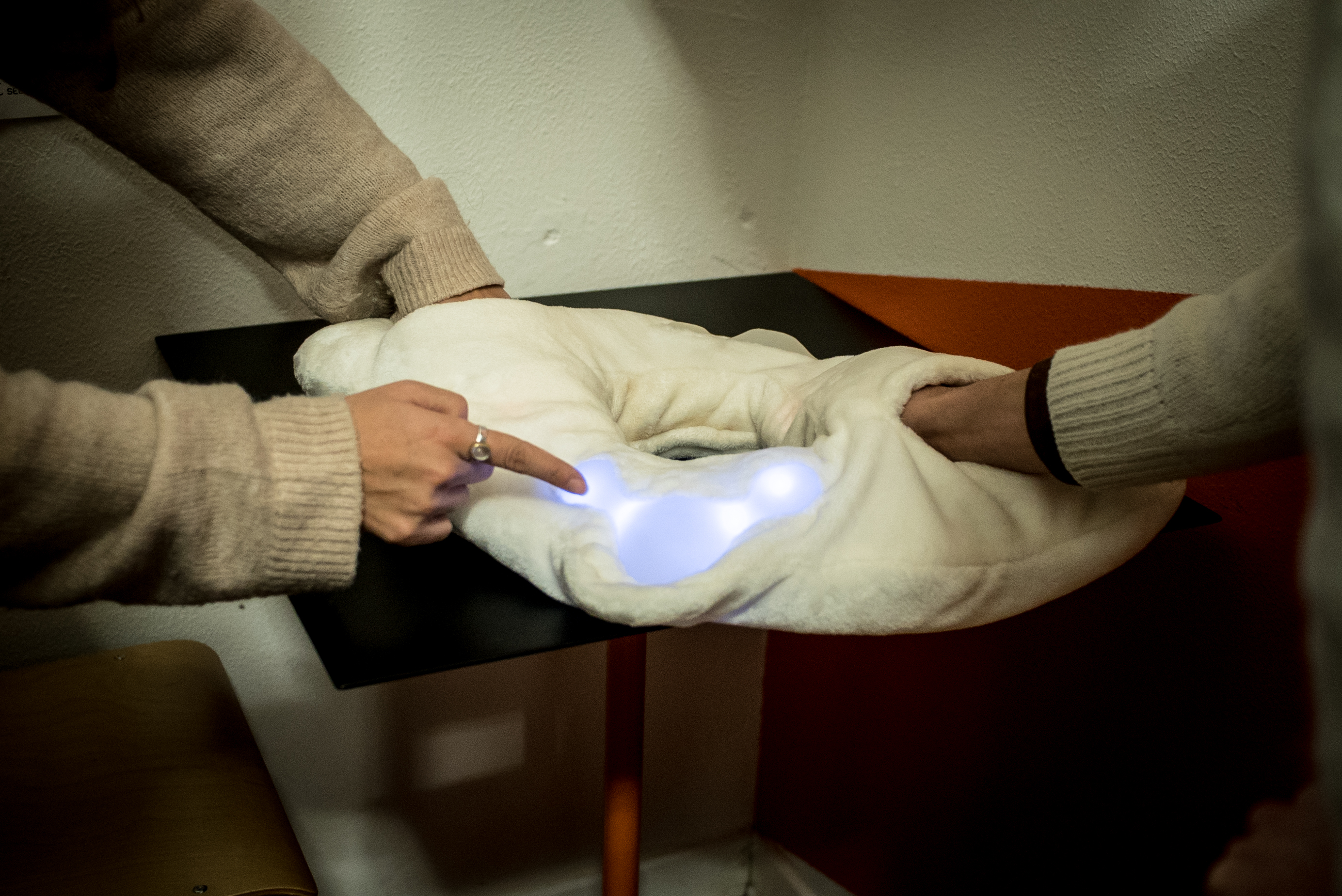
Lokahi
What: Interactive installation, wearable technology
Who: Technoromantics
Where: TOMO Libreria Caffè, Via degli Etruschi, 4| From 12-21 dec sede 4Changing / HER, via dei Rutoli 2
From: Rome (It) / Istanbul (Tr)
Details
Lokahi is a wearable body pillow for co-feeling through human interfaces, which lets two users visualize their own heartbeat through synchronized pulsating lights. The artwork promotes an intimate hug between users. Lokahi means harmony and balance in Hawaiian language.
According to the authors, feeling such feedbacks (the beats of one’s own heart) can connect people, allowing us to co-feel: the experience of feeling together can be improved by visualising the heartbeats (is more likely that two hearts would start beating at the same time by using the device).
Lokahi is based on the principle of photoplethysmography (PPG), a non- invasive technique to measure the blood volume variations in tissues using a light source and a detector. Since the change in blood volume is synchronous to the heartbeat, this method can be used to detect the heart rate. Two PPG sensors are embedded within two Lokahi pouches, where users can put their index fingertip.
It
Lokahi è un cuscino indossabile per co-feeling (sentire contemporaneamente) attraverso delle interfacce umane, che permette a due utenti di visualizzare il proprio battito cardiaco attraverso luci pulsanti sincronizzate. L’opera d’arte ha l’obiettivo di creare un abbraccio intimo tra gli utenti. Lokahi significa armonia ed equilibrio in hawaiano.
Secondo gli autori, la sensazione di tali feedback (i battiti del proprio cuore) riesce a collegare le persone, permettendo di sentire contemporaneamente (co-feel): questa esperienza può essere migliorata visualizzando i battiti cardiaci (è più probabile che i due cuori comincino a battere contemporaneamente utilizzando il dispositivo).
Lokahi è basata sul principio di fotopletismografia (PPG), una tecnica non invasiva per misurare le variazioni di volume del sangue nei tessuti utilizzando una sorgente luminosa e un rivelatore. Poiché la variazione del volume del sangue si sincronizza con il battito cardiaco, questo metodo può essere utilizzato per rilevare la frequenza cardiaca. Due sensori PPG sono integrati in due punti di Lokahi, dove gli utenti possono mettere la punta del dito indice.
Info
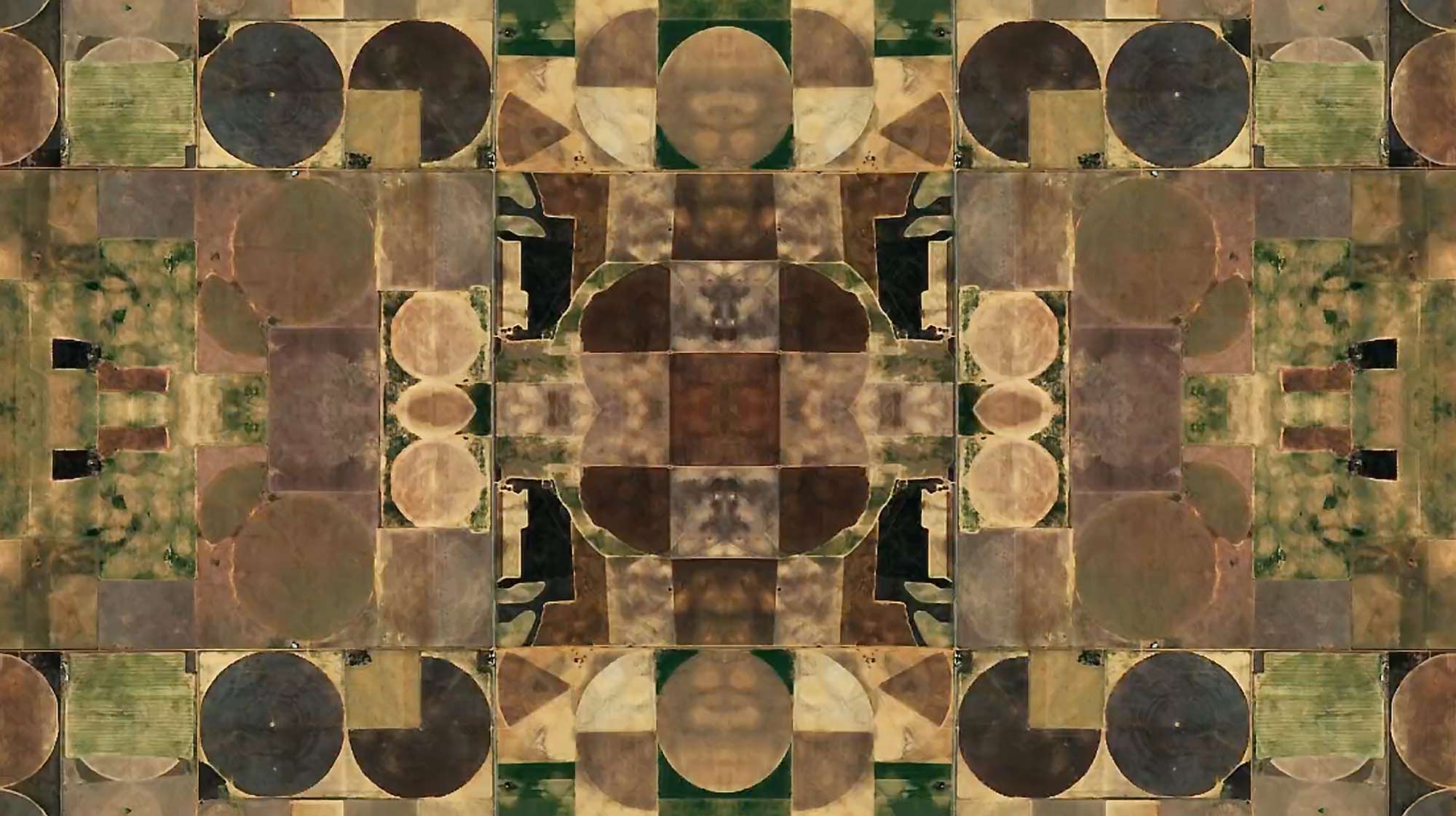
Arena
What: experimental short
Who: Paraic Mc Gloughlin
Where: Bar dei Brutti, Via dei Volsci, 71-73| From 12-21 dec sede 4Changing / HER, via dei Rutoli 2
From: Sligo, Ireland
Details
A film created using Google Earth imagery. A brief look at the earth from above, based on the shapes we make, the game of life, our playing ground .The starting point of the project is that cityscapes are at the same time becoming the norm and are in themselves some kind of natural evolution of the planet’s environment.
It
Un video creato con l’ausilio delle immagini di Google Earth. Un breve sguardo alla terra dall’alto, basato sulle forme che realizziamo, il gioco della vita, il nostro terreno di gioco, il punto di partenza del progetto è che i paesaggi urbani stanno diventando allo stesso tempo la nostra normalità e sono di per sé una sorta di evoluzione naturale dell’ambiente del pianeta.
Info
Density Room
What: group exhibit / esercizi di Infopoetry 2015-2018
Who: DensityDesign + Wild Mazzini
Where: sede 4Changing / HER, via dei Rutoli 2
From: Milano (It)
Details
La mostra collettiva è realizzata dal DensityDesign Lab del Politecnico di Milano e Wild Mazzini – data art gallery di Torino. Attraverso i linguaggi del video e del digitale, dodici progetti realizzati da altrettanti studenti, in un totale di 15 minuti, esplorano temi sociali, ambientali e tecnologici, portando alla luce aspetti della realtà altrimenti nascosti nella complessità dei fenomeni e nella vasta mole dei dati che questi producono.
Frutto dei corsi e del lavoro sviluppato dai docenti Paolo Ciuccarelli e Salvatore Zingale, questi progetti nascono come esercizi di Infopoetry, tra il 2015 ed il 2018, con l’obiettivo di ibridare le tecniche dell’information design con un approccio poetico alla rappresentazione della realtà. La mostra offre allo spettatore un’indagine su eventi e fenomeni della contemporaneità attraverso la trasformazione di dati strutturati e non strutturati in esperienze coinvolgenti.
Eng
The group exposition is carried out by the Politecnico DensityDesign Lab in Milan and by Wild Mazzini – data art gallery in Torino. By means of visual and digital language, twelve students have implemented twelve projects that in 15 minutes explore social, environmental and technological issues revealing some aspects of reality that are otherwise lost in the complexity of phenomena and in the related amount data produced.
Result of the work and the courses developed by professors Paolo Ciuccarelli and Salvatore Zingale, these projects, were born between 2015 and 2018 as exercises of Infopoetry, with the aim of hybridizing the techniques of information design with a poetic approach for the representation of reality. The exhibition offers the viewer an investigation into contemporary events and phenomena through the transformation of structured and unstructured data into immersive experiences.
Autori/Authors: Giulia Piccoli Trapletti, Francesco Bianchi, Marta Mandile, Chiara Bonsignore, Yue Qiu, Valeria Brienza, Sofia Girelli, Francesco Giudice, Giovanni Battista Pesarini, Marta Morandi, Pietro Cedone e Caludio Fabbro
Info
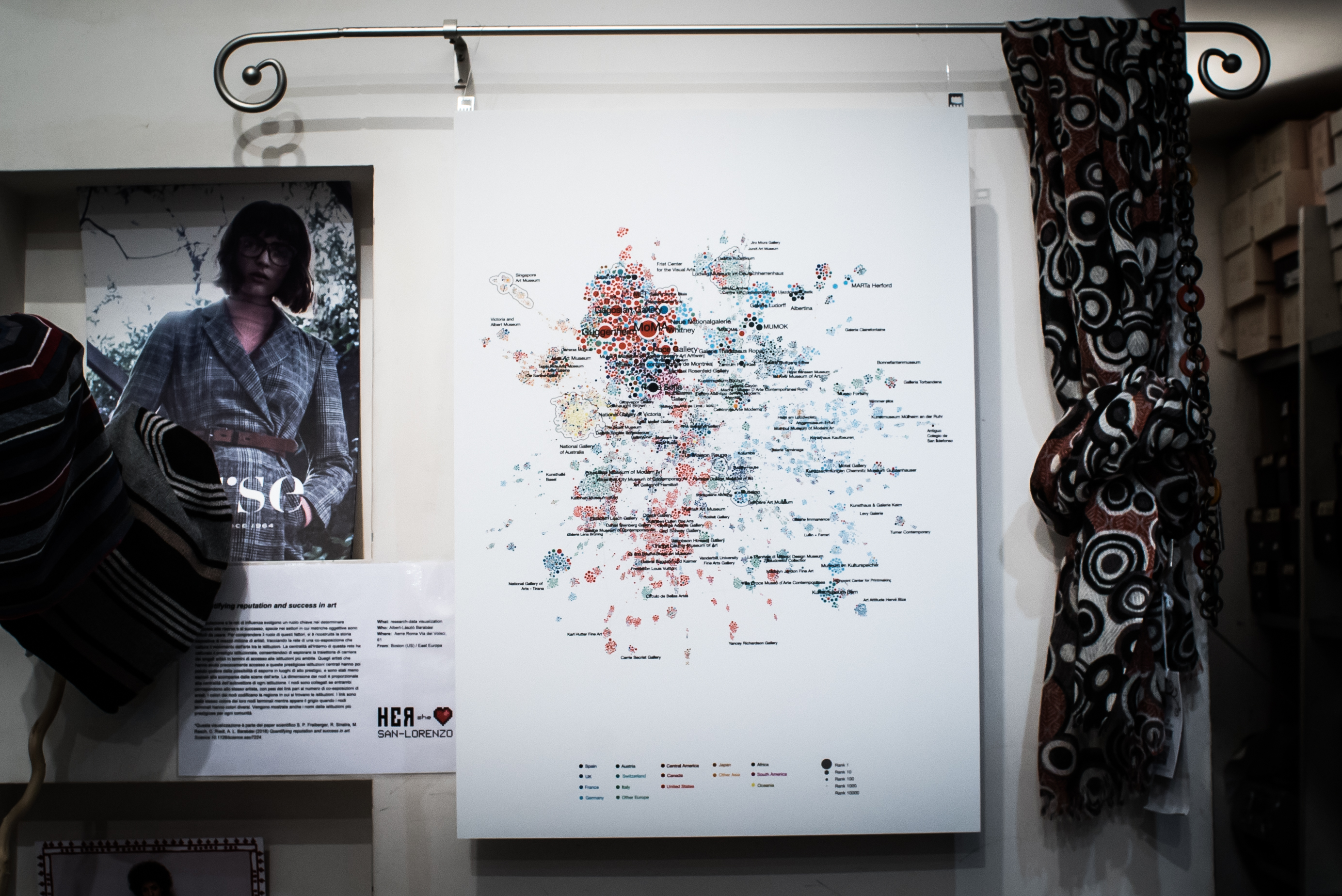
Quantifying reputation and success in art
What: research-data visualization
Who: Albert-László Barabási
Where: Aerre Roma Via dei Volsci, 61
From: Boston (USA)
Details
This visualization is part of the scientific paper S. P. Fraiberger, R. Sinatra, M. Resch, C. Riedl, A. L. Barabási (2018) Quantifying reputation and success in art. Science 10.1126/science.aau7224.
In areas of human activity where performance is difficult to quantify in an objective fashion, reputation and networks of influence play a key role in determining access to resources and rewards. To understand the role of these factors, we reconstructed the exhibition history of half a million artists, mapping out the coexhibition network that captures the movement of art between institutions. Centrality within this network captured institutional prestige, allowing us to explore the career trajectory of individual artists in terms of access to coveted institutions. Early access to prestigious central institutions offered life-long access to high-prestige venues and reduced dropout rate.
(Legend)
Node size is proportional to each institution’s eigenvector centrality. Nodes are connected if they both exhibited the same artist, with link weights being equal to the number of artists’ coexhibitions. Node colors encode the region in which institutions are located. Links are of the same colors as their end nodes, or gray when end nodes have different colors. We also show the names of the most prestigious institution for each community.
It
La reputazione e le reti di influenza svolgono un ruolo chiave nel determinare l’accesso alle risorse e al successo, specie nei settori in cui metriche oggettive sono difficili da usare.
*Questa visualizzazione è parte del paper scientifico S. P. Fraiberger, R. Sinatra, M. Resch, C. Riedl, A. L. Barabási (2018) Quantifying reputation and success in art. Science 10.1126/science.aau7224.
Misurare gli impatti e il successo di un’iniziativa è difficile in molti settori, specie quelli umanistici. Nei settori dell’attività umana in cui è difficile quantificare oggettivamente le performance, la reputazione e le reti di influenza svolgono un ruolo chiave nel determinare l’accesso alle risorse e al successo. Per comprendere il ruolo di questi fattori, si è ricostruita la storia espositiva di mezzo milione di artisti, tracciando la rete di una co-esposizione che cattura il movimento dell’arte tra le istituzioni. La centralità all’interno di questa rete ha catturato il prestigio istituzionale, consentendoci di esplorare la traiettoria di carriera dei singoli artisti in termini di accesso alle istituzioni più ambite. Quegli artisti che hanno avuto precocemente accesso a queste prestigiose istituzioni centrali hanno poi potuto godere della possibilità di esporre in luoghi di alto prestigio, e sono stati meno esposti alla scomparsa dalle scene dell’arte.
La dimensione dei nodi è proporzionale alla centralità dell’autovettore di ogni istituzione. I nodi sono collegati se entrambi corrispondono allo stesso artista, con pesi dei link pari al numero di co-esposizioni di artisti. I colori dei nodi codificano la regione in cui si trovano le istituzioni. I link sono dello stesso colore dei loro nodi terminali mentre appare il grigio quando i nodi terminali hanno colori diversi. Vengono mostrate anche i nomi delle istituzioni più prestigiose per ogni comunità.
Info
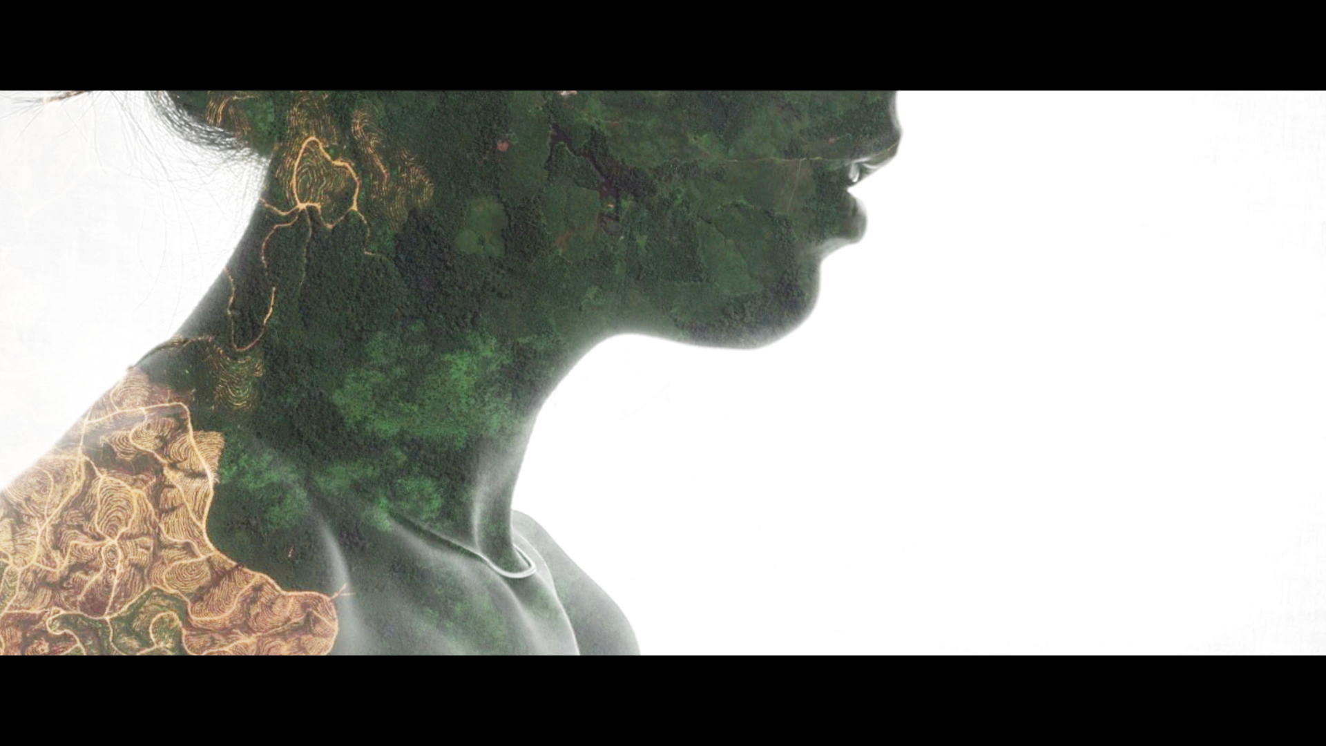
We all have data shadows
What: Interactive Installation
Who: Joanna Sleigh
Where: Esc Atelier, Via dei Volsci, 159.
From: Sydney (AU) / Berlin (G)
Details
Data collection and processing raises a number of pertinent issues and concerns, such as what happens to collected data? Will it lead to discrimination? How is it stored? How is it protected? Is it possible to completely de-identify / anonymize information? Could technological protections improve in the future, or will our notion of privacy shift altogether, maybe even disappear? These questions of data storage – of mass collection, of processing and of interoperability – form the conceptual foundation of this installation.
This participatory ambient data visualization reflects upon the increasing datafication of daily life – from social media to genomics – and considers pressing new questions of security, privacy and the capacity of forgetting in the digital age.
It
La raccolta e l’elaborazione dei dati solleva una serie di questioni e preoccupazioni importanti, come ad esempio cosa succede ai dati raccolti? Creano discriminazioni? Come vengono archiviati? Come vengono protetti? E’ possibile de-identificare/anonimizzare completamente le informazioni? Le protezioni tecnologiche potrebbero migliorare in futuro, o la nostra nozione di privacy cambierà del tutto, o forse scomparirà? Queste questioni di archiviazione dei dati – di raccolta di massa, di elaborazione e di interoperabilità – costituiscono la base concettuale di questa installazione.
Questa visualizzazione partecipativa dei dati rispecchia la crescente diffusione dei dati nella vita quotidiana – dai social media alla genomica – e prende in considerazione nuove e pressanti questioni di sicurezza, di privacy e della capacità di dimenticare nell’era digitale.
Info
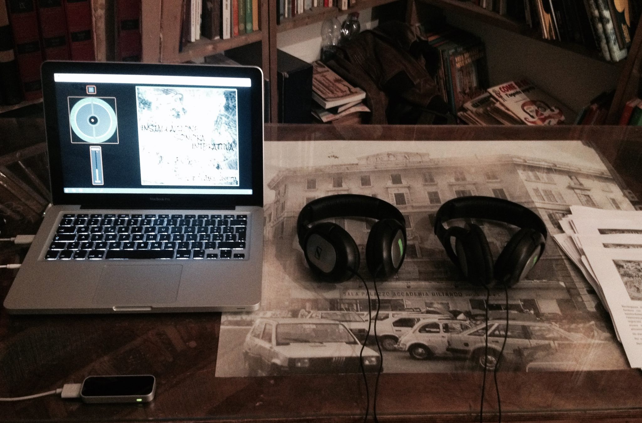
Resound 2.0
What: Interactive sound installation + infrared sensors
Who: Luana Lunetta
Where: Libreria Equilibri,Via degli Equi, 14
From: Rome (It)
Details
Installazione sonora binaurale interattiva per cuffie, con audio tridimensionale
Ambisonics, audio stereofonico e spazializzazioni tramite sensori ad infrarossi.
Riecheggiare di memorie e sonorità del secolo scorso che si fondono con paesaggi
sonori contemporanei: dai suoni dei bombardamenti del 1943 ai paesaggi sonori
rielaborati con l’elettronica. Le eterogenee sonorità del quartiere San Lorenzo,
registrate durante il giorno e nel cuore della notte, possono essere messe in risalto,
alternate e spazializzate al tempo stesso, attraverso il movimento delle mani su
sensori ad infrarossi.
Un viaggio intimo individuale e sociale. Per un ascolto attivo e consapevole.
Eng
Interactive binaural sound installation for headphones, with three-dimensional audio Ambisonics, stereophonic audio and spatializations through infrared sensors.
Re-echoing memories and sounds of the last century that blend with landscapes contemporary sounds: from the sounds of the 1943 bombardments to the sound landscapes reworked with electronics. The heterogeneous sounds of the San Lorenzo district, recorded during the day and in the middle of the night, can be highlighted, alternate and spatialized at the same time, through the movement of hands on infrared sensors.
An intimate, individual and social journey. For active and conscious listening.
Info
OddityViz
What: information design
Who: Valentina D’Efilippo + Miriam Quick + Wild Mazzini
Where: Impact Hub Roma, Viale dello Scalo S. Lorenzo, 67.
From: Londra (UK) / Torino (It)
Details
Space Oddity – a visual deconstruction, aka Oddityviz, is a data visualisation project on David Bowie’s Space Oddity by designer Valentina D’Efilippo and researcher Miriam Quick.
The project visualises data from Bowie’s 1969 track Space Oddity on a series of 10 specially engraved records with accompanying posters, plus a moving image piece. Each 12-inch disc deconstructs the track in a different way: melodies, harmonies, lyrics, structure, story and other aspects of the music are transformed into new visual systems.
Each record deconstructs the track in a different way. The 10 records are like 10 different angles on the same song, each illuminating a different aspect of it but all using the same format: one rotation of the record equals the length of the song. (Narrative/ Recording/ Texture/ Rhythm/ Harmony/Structure/ Melody / Lyrics / Trip/ Emotions)
It
Space Oddity, aka Oddityviz – una decostruzione visiva – è un progetto di visualizzazione dei dati della designer Valentina D’Efilippo e della ricercatrice Miriam Quick basato su Space Oddity di David Bowie.
Il progetto visualizza i dati del brano Space Oddity di Bowie del 1969 su una serie di 10 dischi appositamente incisi con poster di accompagnamento, più un’immagine in movimento. Ogni disco da 12 pollici decostruisce la traccia in modo diverso: melodie, armonie, testi, struttura, storia e altri aspetti della musica si trasformano in nuovi sistemi visivi.
Ogni disco decostruisce la traccia in modo diverso. I 10 dischi sono come 10 angoli diversi della stessa canzone, ognuno illumina un aspetto diverso di essa pur utilizzando tutti lo stesso formato: una rotazione del disco equivale alla lunghezza della canzone. (Narrativa/ Registrazione/Tessuto/Tempo/ Ritmo/ Armonia/Struttura/Struttura/Melodia/ Testi / Viaggio/ Emozioni)
Info
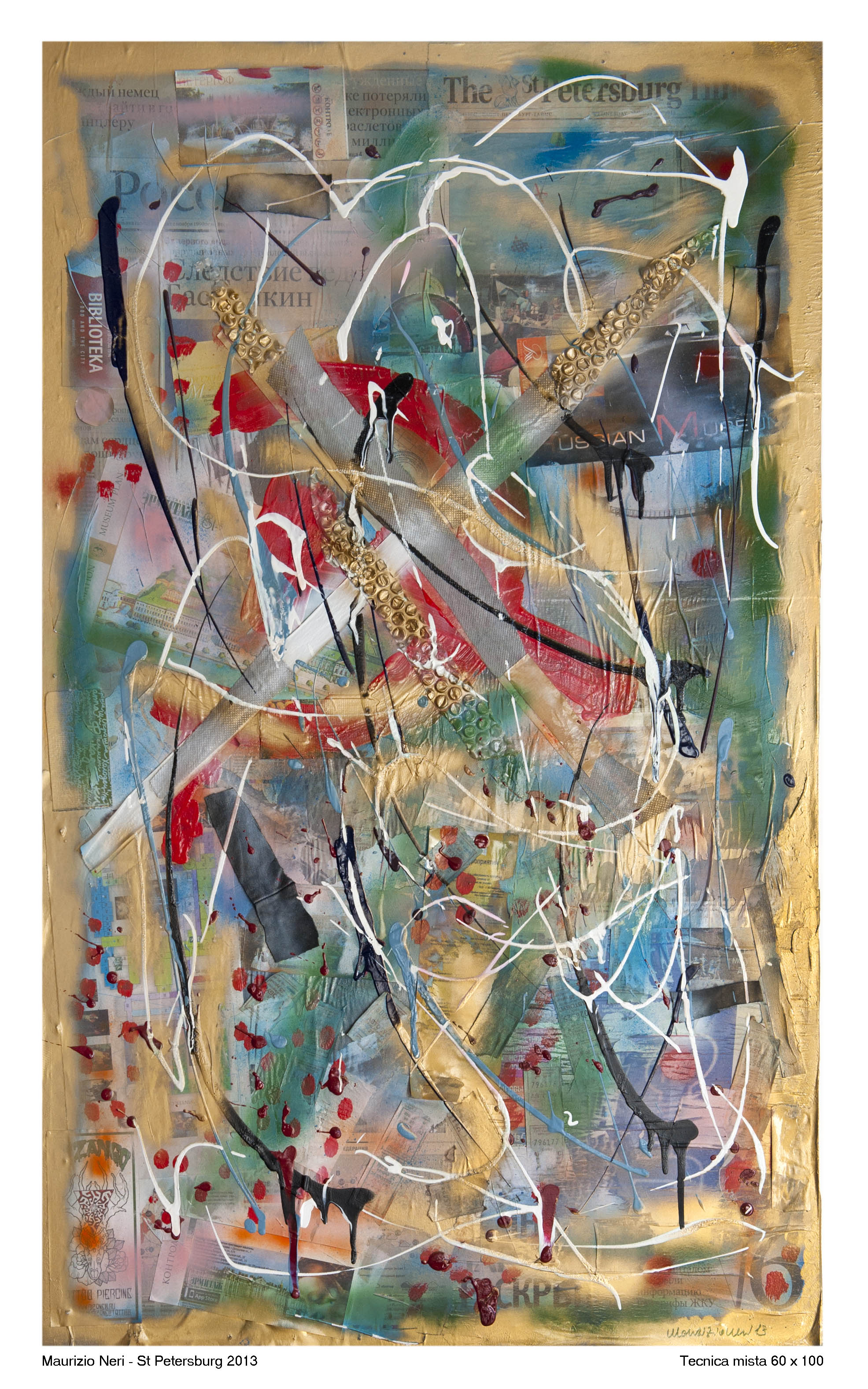
San Pietroburgo 2013
What: collage
Who: Maurizio Neri
Where: Kitchen alimentari Via degli Equi, 58
From: Roma(it)
Details
Between the travel diary and the cut-up, St. Petersburg 2013 is part of a series of artwork that Maurizio Neri realizes collecting materials from his travelling: newspaper clippings, taxi receipts, movie film tickets, museums, exhibitions, theatrical performances, restaurant receipts are the analogical tracks (data) that are stratified on the table, reworked through a further layer of color.
It
Fra il diario di viaggio e il cut-up, San Pietroburgo 2013 fa parte di una serie di tavole che Maurizio Neri realizza raccogliendo materiali dalla città che sta attraversando. Ritagli di giornali, ricevute di taxi, biglietti di cinema, musei, mostre, spettacoli teatrali, ricevute del ristorante sono le tracce analogiche (i dati) che si stratificano sulla tavola, rielaborati attraverso un ulteriore strato di colore.
Info
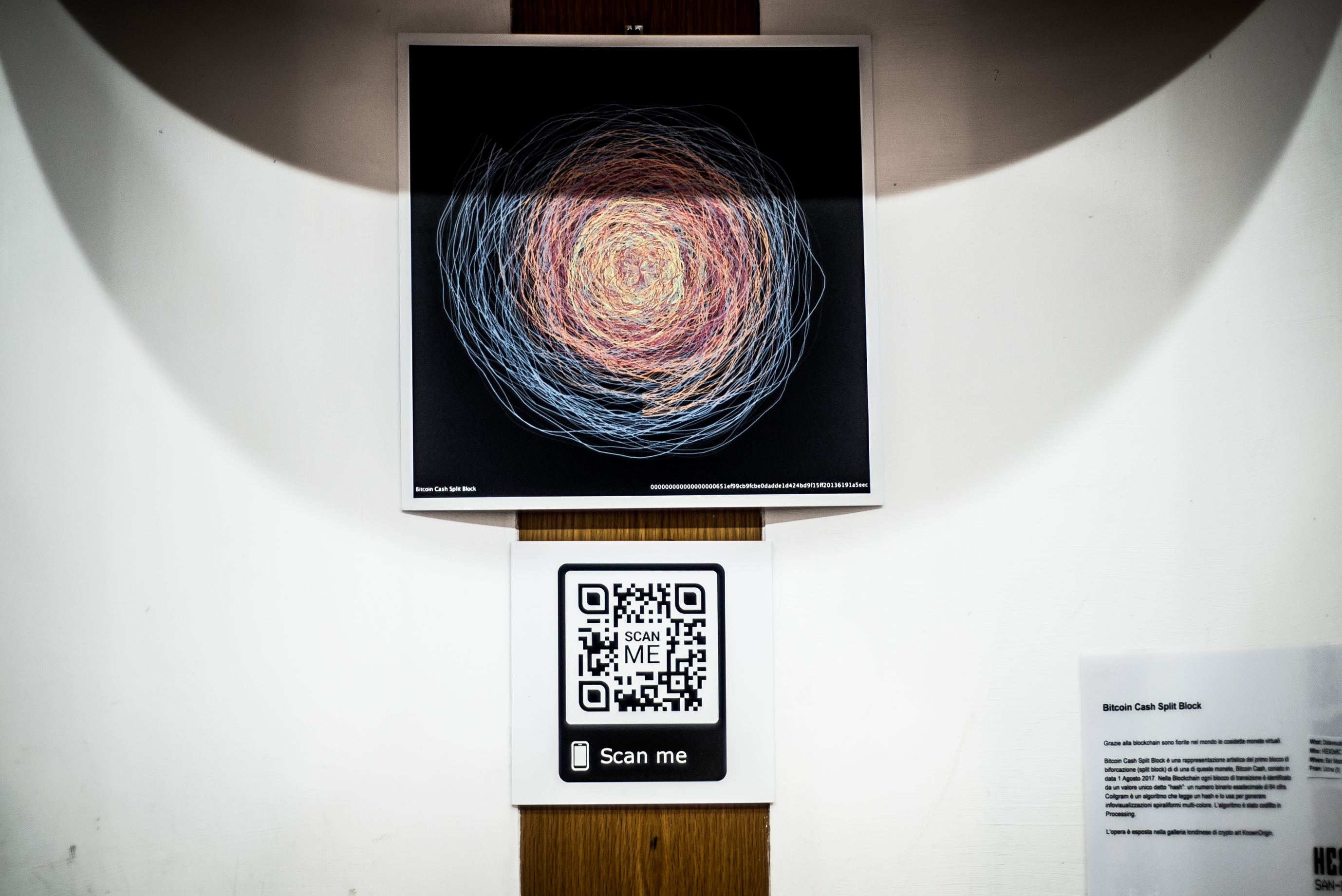
Bitcoin Cash Split Block
What: Data visualization
Who: HEX0x6C
Where: Bar Marani, Via dei Volsci, 57
From: Udine (It)
Details
Grazie alla blockchain sono fiorite nel mondo le cosidette monete virtuali. Bitcoin Cash Split Block è una rappresentazione artistica del primo blocco di biforcazione (split block) di di una di queste monete, Bitcoin Cash, coniato in data 1 Agosto 2017. Nella Blockchain ogni blocco di transizione è identificato da un valore unico detto “hash”: un numero binario esadecimale di 64 cifre. Coilgram è un algoritmo che legge un hash e lo usa per generare infovisualizzazioni spiraliformi multi-colore. L’algoritmo è stato codifito in Processing.
L’opera è esposta nella galleria londinese di crypto art KnownOrigin.
Eng
Bitcoin Cash Split Block is the artistic representation of the split block (term coined on August 1, 2017) of the Bitcoin Cash blockchain, produced through Coilgram. Each block of transactions in a blockchain is identified by a hash value, which is an hexadecimal number with 64 figures, corresponding to a binary number with 256 bits. All hashes are unique.
Coilgram is an algorithm that reads a hash and uses it to forge artworks shaped as colored intertwined coils.. A block hash is just a string of characters and Coilgram represents it in a creative way. The algorithm has been coded in Processing language.
The work is exhibited in the London crypto art gallery KnownOrigin (a scan of the attached QR code will lead you to the gallery). It is probably the first work of crypto art to be exhibited in an official exhibition in Italy.
Info
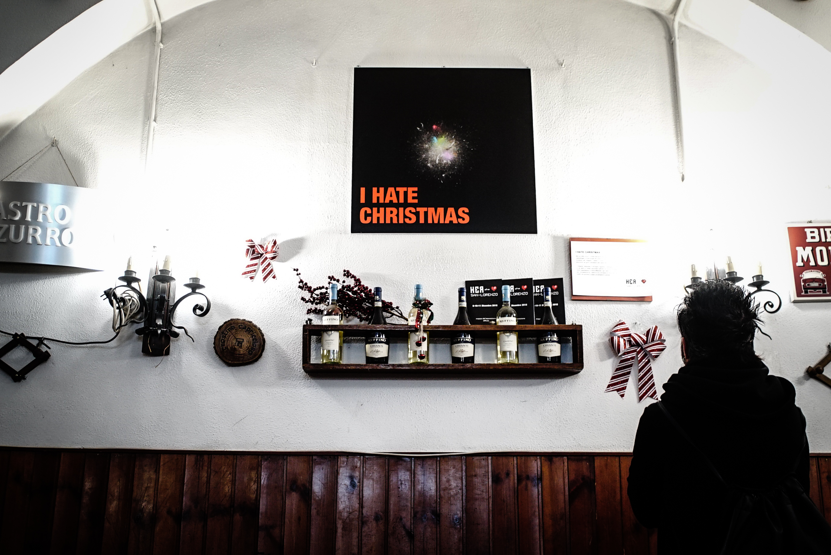
I Hate Christmas
What: Infoestetica stampata su forex
Who: Salvatore Iaconesi + HER – Human Ecosystems Relazioni
Where: Pizzeria Formula 1, Via degli Equi 13
From: Roma (It)
Details
In his ironic style, the artist Salvatore Iaconesi uses the methodologies and technologies of the HER research center, of which he is the founder, to investigate Christmas and the way in which people express themselves in the days before the eve of the year 2017.
The survey, carried out in 29 languages, concerns public messages in which Twitter users tell why they do not love Christmas. Each color represents a different theme, each dot is a user, every connection between the dots is a connection between the digital identities that animate this global conversation.
IT
Nel suo stile ironico, l’artista Salvatore Iaconesi utilizza le metodologie e le tecnologie del centro di ricerca HER, di cui è fondatore, per indagare il natale e il modo in cui le persone si esprimono nei giorni precedenti alla vigilia dell’anno 2017. L’indagine, realizzata in 29 lingue, riguarda i messaggi pubblici in cui gli utenti di Twitter raccontano perché non amano il natale. Ogni colore rappresenta un tema differente, ogni pallino è un utente, ogni connessione fra i pallini è una connessione fra le identità digitali che animano questa conversazione globale.
Info
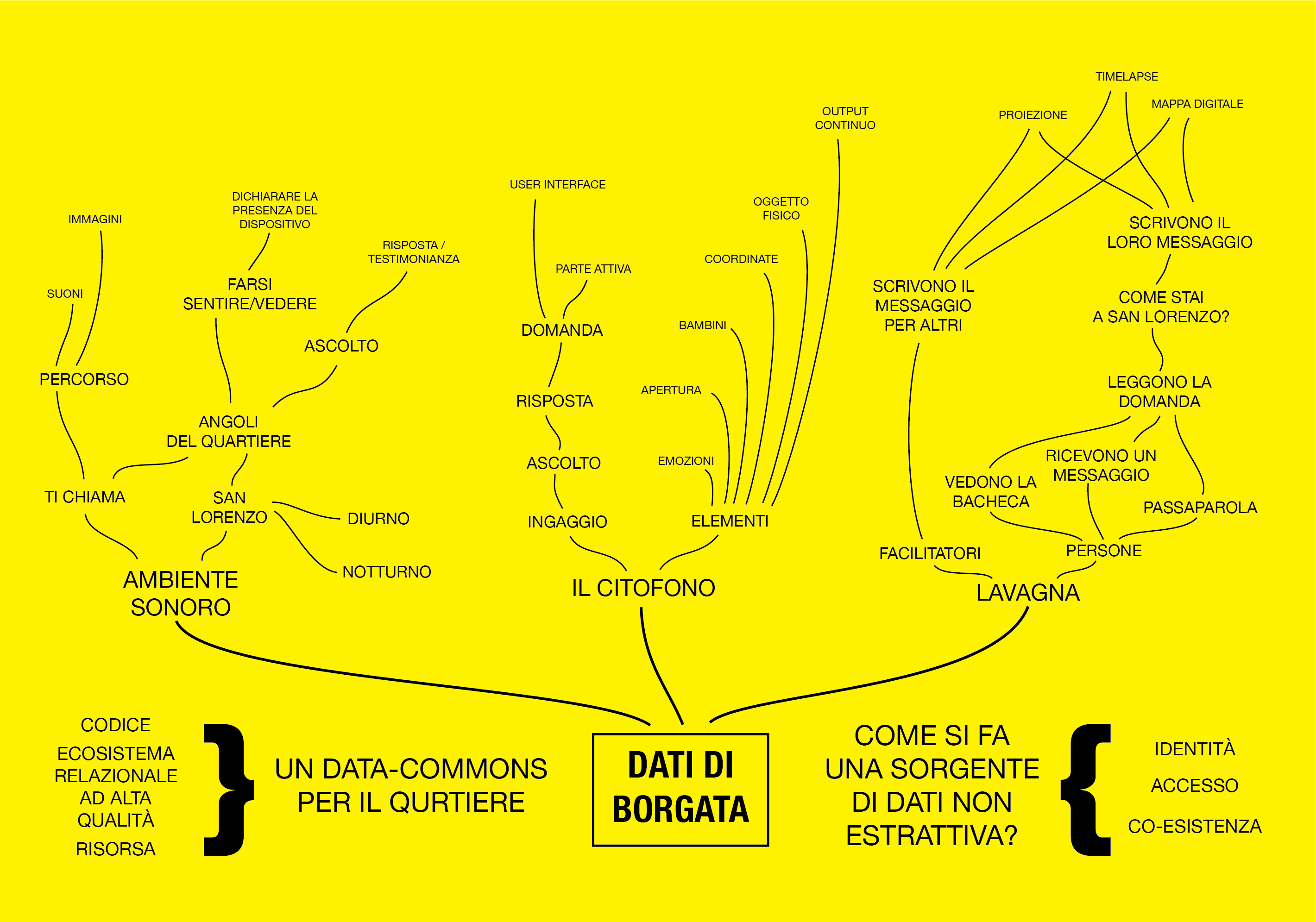
Dati di Borgata- Output workshop
What: Group exhibit / Graphs printed on forex
Who: I partecipanti del workshop Dati di Borgata + il docente Salvatore Iaconesi
Where: sede 4Changing/HER, via dei Rutoli 2
From: Italy
Details
On the 11th November 2018 the workshop was held by Salvatore Iaconesi, introducing the educational path of the festival with a founding value: to provide San Lorenzo with the first non-extractive source of data and to understand how to transform it into a common good using Elinor Ostrom terms (resource, high quality ecosystem, the possibility for participants to provide themselves with rules). During the workshop, three groups of participants elaborated three concepts to create sources of participatory data generated with people, and transform them into meaningful and accessible experiences in the public space of the neighborhood.
Gruppo Ambiente Sonoro
Usare il suono del quartiere per raccogliere i dati. Il “dispositivo” si manifesta e ti dà la possibilità di esprimerti, di farti sentire (/vedere).
Si forma un percorso nel quartiere, creato dai landmark per l’espressione, che formano un suono del quartiere, percorribile, da cui trarre dati (quello che dicono le persone, il livello e la tipologia del suono ambientale, la differenza tra il giorno e la notte e tra i vari punti del quartiere…).
Nel dispositivo posso origliare/ascoltare, o posso esprimermi, dando una risposta/testimonianza alla richiesta di espressione.
Autori: Vittorio Alvino, Aureliano Capri, Dario Carrera, Manuel Grillo, Herbert Natta, Simone Urbinati, Maria Valese, Anna Villa, Cristina Vitucci
Group Sound Environment
Using the sound of the neighborhood to collect data. The “device” appears and gives you the chance to express yourself, to make yourself heard (/seen).
It forms a path in the neighborhood, created by the landmarks for expression, which create a viable sound of the neighborhood, from which is possible to get data (what people say, the level and type of environmental sound, the difference between day and night and between the different places of the neighborhood …).
In the device I can eavesdrop/listen in, or I can express myself, giving an answer/testimony to the request for expression.
Gigi, il Citofono
Un dispositivo di comunicazione e coinvolgimento trova una nuova vita.
Un citofono, installato in diversi punti del quartiere. Puoi suonare, oppure ti chiama lui, squillando (puoi resistere a un citofono che squilla?). Al citofono si risponde alla domanda lasciata dalla persona che ha risposto per ultima prima di te. Una volta risposto, si può lasciare la domanda in sospeso per il prossimo.
Autori: Bruno Capezzuoli, Stefano Coviello, Martina Manna, Giuseppe Nenna, Filippo Menconi, Giulia Paciello, Marco Stancati, Anna Uttaro,
Gigi, the intercom
A device for communication and involvement finds a new life.
An intercom, installed in different parts of the district. You can play, or it calls you, ringing (can you resist an intercom that rings?). At the door phone you answers the question left by the person who last answered before you. Once answered, you can leave the question open for the next one.
Autori: Bruno Capezzuoli, Stefano Coviello, Martina Manna, Giuseppe Nenna, Filippo Menconi, Giulia Paciello, Marco Stancati, Anna Uttaro
Lavagna di quartiere
Una lavagna/messageboard ibrida, fra dimensione fisica e digitale, e il curatore delle espressioni. Le persone vedono la lavagna, nello spazio del quartiere e/o online. C’è una domanda (“Come stai a San Lorenzo?”). Si può rispondere per sé stessi o per altri: il curatore chiederà in giro per riportare sulla lavagna, garantendo l’accessibilità (es: un anziano potrebbe non desiderare scrivere sulla lavagna in pubblico). Si raccolgono i dati dalla lavagna in analisi di linguaggio naturale/computer vision. Si rappresentano con delle proiezioni (timelapse, visualizzazione, collage, mappa digitale) o in altre forme. Si creano dei punti nel quartiere che si possono caratterizzare. Diversi timeframe per vedere le differenze, anche nell’arco della giornata (giorno/notte). L’installazione è temporanea, massimo di una settimana: si presta per essere parte di eventi, o l’evento è l’installazione della lavagna emozionale di quartiere come progetto di arte partecipativa sull’espressione.
Autori: Elena Giulia Abbiatici, Daniele Bucci, Tiziana Canal, Daniele De Mitri, Valeria Gallo, Valeria Loreti, Isabella Mancioli, Nicola Martinelli, Valeria Michetti, Cristina Vitucci
A blackboard for the neighborhood
A blackboard/ hybrid messageboard, between the physical and digital dimensions, and the curator of expressions. People see the board, in the neighbourhood space and/or online. There is a question (“How are you in San Lorenzo?”). You can answer it for yourself or for others: the curator will ask around and then will report on the board, ensuring accessibility (e.g.: an elderly person may not want to write on the board in public). Data is, then, collected from the board in natural language analysis/computer vision. They are represented with projections (timelapse, visualization, collage, digital map) or in other forms. In this way, in the neighborhood there are points that could be characterized.
Different timeframes to see the differences, even during the day (day/night). The installation is temporary, maximum of one week: it lends itself to be part of events, or the event is the installation of the neighborhood emotional blackboard as a project of participatory art on expression.
Autori: Elena Giulia Abbiatici, Daniele Bucci, Tiziana Canal, Daniele De Mitri, Valeria Gallo, Valeria Loreti, Isabella Mancioli, Nicola Martinelli, Valeria Michetti, Cristina Vitucci
Info
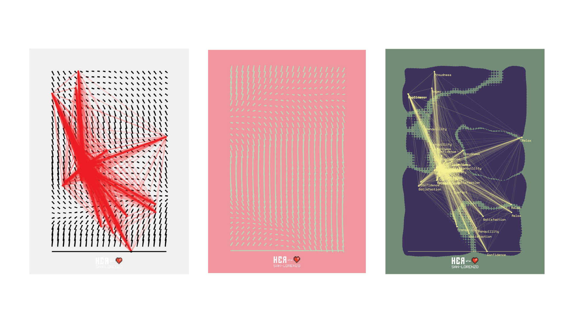
pOSter. Un approccio Open Source alla grafica generativa- Output workshop
What: Group exhibit / Graphs printed on paper
Who: I partecipanti del workshop pOSter + il docente Bruno Capezzuoli
Where: sede 4Changing/HER, via dei Rutoli 2
From: Italy
Details
The workshop, curated by Bruno Capezzuoli, took place on 16th and 17th November. Using the data source opened by HER to collect public expressions, expressed on social networks in the San Lorenzo neighbourhood (public messages on Twitter, Instagram, selected public pages and Facebook groups), the group focused on emotional expressions: each participant, using Processing, created a generative poster composed of the emotions of San Lorenzo. Each participant brought with him the software developed in open source mode, ready to be reused and customized.
Ita
Il workshop, a cura di Bruno Capezzuoli, si è svolto il 16 e 17 novembre. Utilizzando la fonte di dati aperta da HER per raccogliere le espressioni pubbliche espresse sui social network nel quartiere di San Lorenzo (messaggi pubblici su Twitter, Instagram, pagine e gruppi Facebook pubblici selezionati), il gruppo si è focalizzato sulle espressioni emozionali: ogni partecipante, utilizzando Processing, ha realizzato un poster generativo composto dalla emozioni di San Lorenzo. Ogni partecipante ha portato con sé il software sviluppato in modalità open source, pronto per essere riusato e personalizzato.
Authors: Matteo Ciafrone, Alessandra Del Nero, Stefano Diana, Edoardo Filippone, Francesco Floris, Paola Iacobellis, Isabella Mancioli, Bodgan Melinte, Valeria Michetti, Herbert Natta, Ludovica Panzera, Nicola Pavone, Alice Picari, Sabrina Scaletta, Marco Taurino, Selene Torlino, Anna Paola, Vacanti, Maria Valese, Michel Zemel.
Info
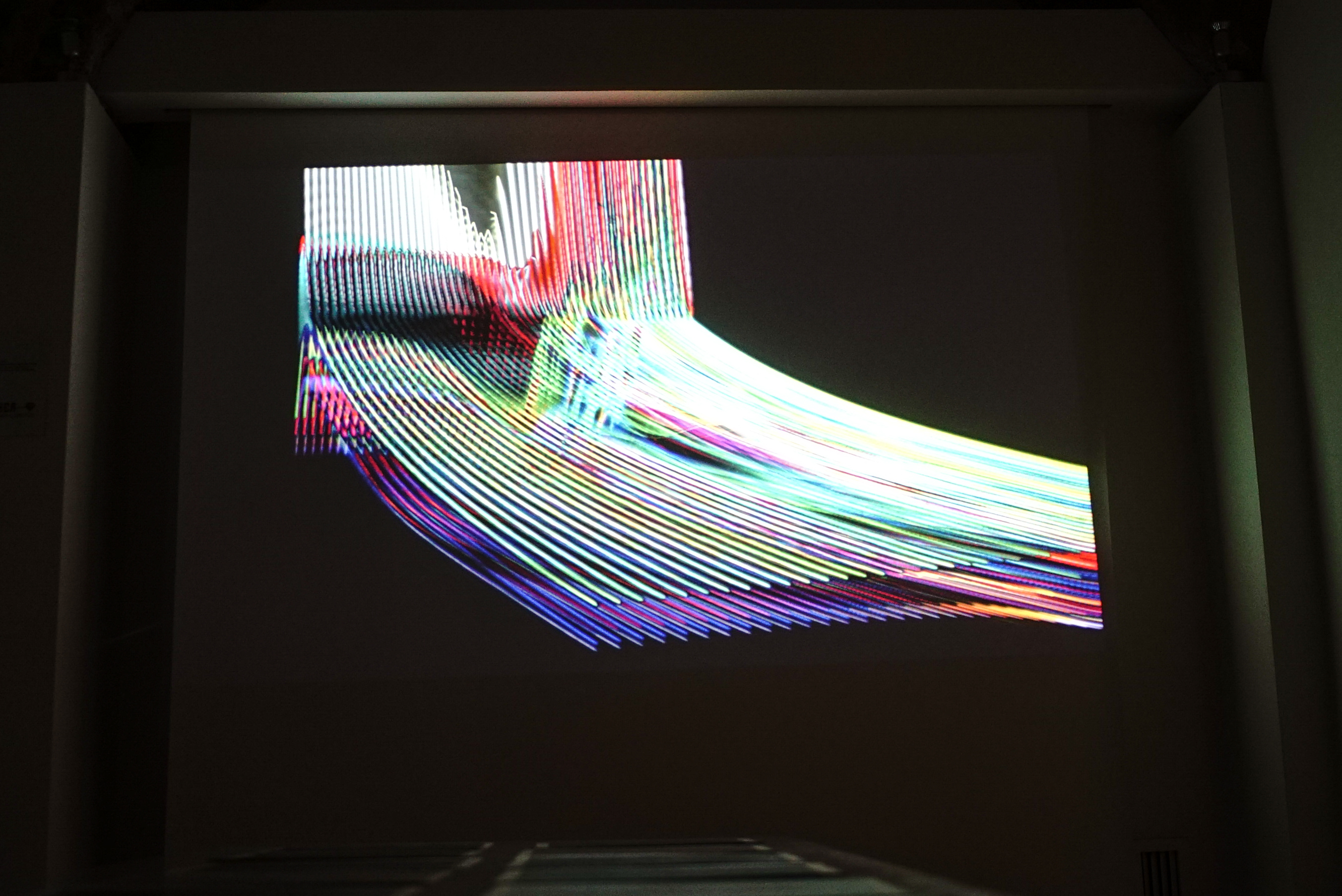
VizzZzz. Percezioni di dati. Output workshop
What: Group exhibit / Infosthetics
Who: I partecipanti del workshop VizzZzz + il docente Gianluca Del Gobbo
Where: sede 4Changing/HER, via dei Rutoli 2
From: Italy
Details
The workshop, curated by Gianluca Del Gobbo, Claudio Sorace and Graziano De Vecchis, was held on November 24th, closing the month of formation of the festival. With the same logic of pOSter, the data on the emotional expressions of the neighborhood have been used to develop sounds and generative visualizations, in TouchDesigner. The result of the workshop are three different visualizations. Each participant brought with him the software developed in open source mode, ready to be reused and customized.
Ita
Il workshop, a cura di Gianluca Del Gobbo, Claudio Sorace e Graziano De Vecchis, si è tenuto il 24 novembre, chiudendo il mese di formazione del festival. Con la stessa logica di pOSter, i dati sulle espressioni emozionali del quartiere sono state utilizzate per sviluppare sonorizzazioni e visualizzazioni generative, in TouchDesigner. Il risultato del workshop sono tre diverse visualizzazioni. Ogni partecipante ha portato con sé il software sviluppato in modalità open source, pronto per essere riusato e personalizzato.
Autori: Marta Marinelli, Diego Proietti Timperi, Livia Ribichini, Pietro Marinelli, Alessandro Iannuzzo, Edoardo Berti.